In one of my recent projects, I extended the default module loading behavior of the CAL application to make modules can be loaded on-demand. So some of the modules are loaded on startup (aka loaded modules) while some are not (aka available modules). Apparently it would be better that we display available modules some where so user can load them when they’re needed.
I dicided to display the modules as a list of ButtonTool in a RibbonGroup of a Infragistics RibbonTabItem as it’s the nice GUI we’re using. However, it’s unfortunate that even though the RibbonTabItem is powerful enough to support office 2007 like GUI but it doesn’t seem to have something like ButtonTool-bar there I can use to bind a list of module infos to and it creates buttons for me. What are the alternatives?
ToolBar control looks good as it’s an items control that meet my data binding purpose, but apparently it needs to be re-styled to change the look and feel. I’m not too familiar with the control so I drop it.
ListBox is the second candidate jumped into my mind and indeed it’s proven to be the one. Thinking about the requirement, what I wanted is a toolbar like items control that creates buttons based on the items in the list bound to it and do some work when the buttons are clicked. ListBox is the best fit as I don’t need extra features like button group, mutual exclusive button, etc.
Now it’s time for the implementation. First thought was simple, I wanted the button to show large image above the text, and the ButtonTool can happen to be set with a dependency property RibbonGroup.MaximumSize=”ImageAndTextLarge” to have exactly the same appearance.
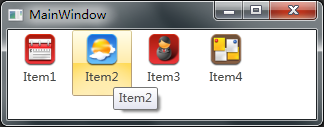
So re-style the ItemTemplate with a ButtonTool looks should do, I think, but the answer is no, the reason being that because RibbonGroup.MaximumSize works only when the ButtonTool is a directly child of a RibbonGroup or a ToolHorizontalWrapPanel.
I have to do the whole thing all by myself finally.
1
2
3
4
5
6
7
8
9
10
11
12
13
14
15
16
17
<StackPanel>
  <StackPanel.Resources>
    <DataTemplate DataType="{x:Type Models:ModuleData}">
      <Button Style="{DynamicResource FlatButtonStyleKey}" Width="60" Height="66"
 Command="{Binding LoadModuleCommand}" ToolTip="{Binding Name}">
        <StackPanel>
          <Image Source="{Binding ModuleImage}" Height="32" Width="32" Margin="0,3,0,0"/>
          <TextBlock Background="Transparent" TextTrimming="CharacterEllipsis" Margin="5,2,5,5"
 Foreground="{DynamicResource TextColorKey}" TextAlignment="Center"
 VerticalAlignment="Bottom" Text="{Binding Name}"/>
        </StackPanel>
      </Button>
    </DataTemplate>
  </StackPanel.Resources>

  <ListBox Style="{DynamicResource WrapListBox}" ItemsSource="{Binding Modules}" Width="Auto"/>
</StackPanel>
Notes:
- The ListBox shows its contents vertically by default because a VirtualizingStackPanel is used in its ItemsPanel . The
WrapListBoxabove simply replaces theStackPanelwith aWrapPanelso items will be shown in a horizontal and wrappable fashion.
1
2
3
4
5
6
7
8
9
10
11
12
13
14
15
16
17
18
<!-- Items of the listbox will be listed vertically and wrappable -->
<Style x:Key="WrapListBox" TargetType="{x:Type ListBox}">
  <Setter Property="ItemsPanel">
    <Setter.Value>
      <ItemsPanelTemplate>
        <WrapPanel/>
      </ItemsPanelTemplate>
    </Setter.Value>
  </Setter>

  <Setter Property="Template">
    <Setter.Value>
      <ControlTemplate>
        <ItemsPresenter/>
      </ControlTemplate>
    </Setter.Value>
  </Setter>
</Style>
- There’s another thing tricky in the
FlatButtonStyleKey. I wanted the flat button looks like the Infragistics ButtonTool – a button without focus visual style. Just keep in mind that simply setFocusVisualStyleto x:Null was not perfect – If the Infragistics Ribbon is set to collapsed, then you click the tab header to expand the ribbon and click on the button, the ribbon won’t automatically collapse itself if FocusVisualStyle is set to x:Null. Instead, you still need to provide a FocusVisualStyle but just don’t do anything in it.
1
2
3
4
5
6
7
8
9
10
11
12
13
<Style x:Key="NoFocusVisualStyle">
  <Setter Property="Control.Template">
    <Setter.Value>
      <ControlTemplate/>
    </Setter.Value>
  </Setter>
</Style>

<Style x:Key="FlatButtonStyleKey" TargetType="{x:Type Button}">
  <!-- Set to NoFocusVisualStyle instead of x:Null to keep the button click behavior -->
  <Setter Property="FocusVisualStyle" Value="{StaticResource NoFocusVisualStyle}"/>
  ......
</Style>
- Everything looks good so far except for one thing – when you right click on a button you’ll see it actually gets selected and being rendered as highlighted because items in a ListBox are selectable! There’re many ways to solve this problem, changing the behavior of the ListBox is one of them, but I’m choosing the simplest way – again, re-styling to rescue, we just don’t highlight the item when it’s selected.
1
2
3
4
5
6
7
8
9
10
11
12
13
14
15
16
<Style x:Key="{x:Type ListBoxItem}" TargetType="{x:Type ListBoxItem}">
  <Setter Property="Template">
    <Setter.Value>
      <ControlTemplate TargetType="{x:Type ListBoxItem}">
        <Border Name="ItemBorder" SnapsToDevicePixels="true">
          <ContentPresenter />
        </Border>
        <ControlTemplate.Triggers>
          <Trigger Property="IsSelected" Value="true">
            <Setter TargetName="ItemBorder" Property="Background" Value="Transparent"/>
          </Trigger>
        </ControlTemplate.Triggers>
      </ControlTemplate>
    </Setter.Value>
  </Setter>
</Style>
Please visit github for the code sample.